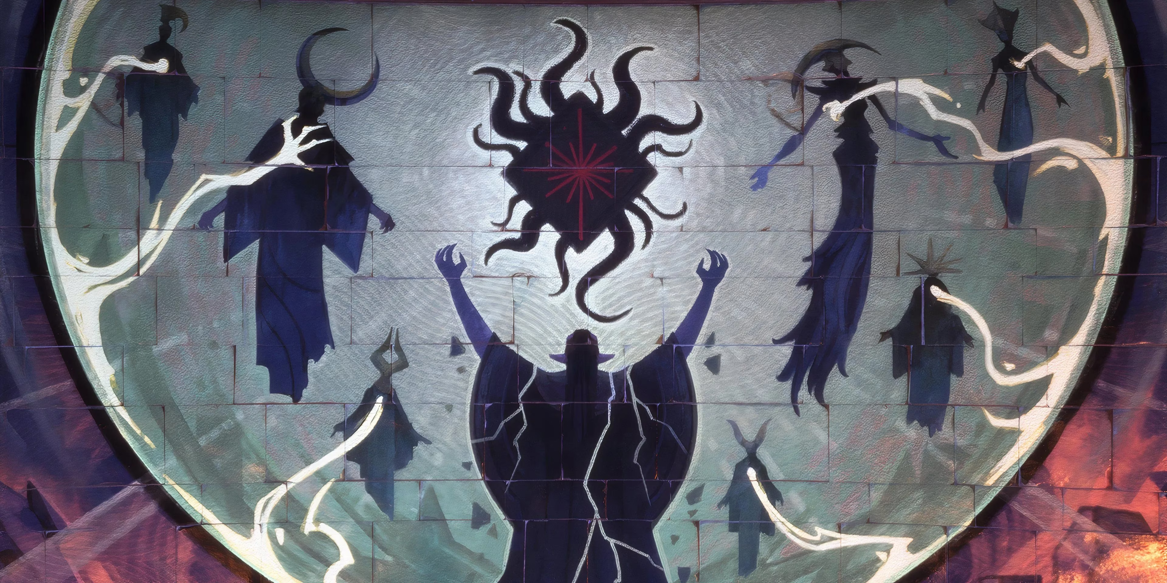
Hey there, fellow players. As someone who spends a lot of time in Night City, I’ve been thinking a lot about what makes Cyberpunk 2077's world so unforgettable. That gritty, rain-slicked, neon-soaked realism is its signature, right? It pulls you in and makes every piece of chrome and every flickering ad feel tangible. But you know what? Playing other games can really make you see things differently. Lately, I’ve been looking at Dragon Age: The Veilguard and its bold, graphic-novel-like art style. It got me wondering... could the Cyberpunk universe ever take a walk on the wilder, more stylized side?

The success of Cyberpunk: Edgerunners already proved that fans are totally on board with a more animated and stylized take on the setting. The show’s visuals were a punch in the gut in the best way possible—vibrant, exaggerated, and full of personality. So, while I don’t think the next mainline Cyberpunk game should throw its gritty realism out the window for a full reboot, there’s a ton of potential in borrowing a page from The Veilguard’s book for specific parts of the world. Think of it as adding a new spice to the recipe, not changing the whole dish.
Let’s talk factions. Night City is already a masterclass in using aesthetics to tell stories. From the sleek, cold minimalism of the Corps to the chaotic, personalized flair of the Nomads, you can tell who controls what just by looking. This is where a selective, bold visual shift could be pure genius. Imagine stumbling into a district run by a hyper-innovative, anti-corporate rebel faction. What if their territory looked like it was ripped straight from a dystopian graphic novel? High-contrast colors, exaggerated lighting, sharp, almost cel-shaded edges—it would instantly scream "rebellion" and visually set them apart from the rest of the city’s grime.
On the flip side, picture a corporate zone that takes "clean" to a terrifying extreme. We’re talking eerie, hyper-stylized perfection: blindingly white surfaces, unnaturally sharp lines, and lighting so controlled it feels oppressive. This wouldn’t just look cool; it would visually underscore the corporation’s total dominance and their chilling detachment from the human mess of Night City. Using The Veilguard’s influence in these focused, narrative-driven ways would be a powerful tool for world-building without sacrificing the core identity.
Now, let’s dive into atmosphere and story. Cyberpunk 2077 isn’t afraid of dark, moody moments—think of the haunting beauty of the Badlands at night or the claustrophobic dread in a corpo interrogation room. The Veilguard leans hard into dark, shaded tones to give weight to its story, and Cyberpunk could turn that dial up even further for specific quests.
Imagine a storyline where you’re delving deep into the fractured psyche of a character suffering from cyberpsychosis. A shift to a more high-contrast, graphic-novel style in those moments could visually represent their isolation and mental decay. 🎭 The world could warp, colors could bleed, and shadows could become impossibly deep, making you feel their disconnection from reality. Or, in a quest exposing the soul-crushing depth of corporate corruption, the visuals could become cold, sharp, and brutally minimalist, amplifying the theme of human cost versus profit. This isn’t about changing the whole game’s look; it’s about using style as another narrative voice.
Of course, I hear you. The hyper-realistic detail of Cyberpunk 2077 is a huge part of why we love it. The way light reflects off wet pavement, the intricate design of every piece of cyberware, the sheer density of Night City—it’s an immersive miracle. A drastic, across-the-board style change for a mainline sequel would definitely risk alienating players (myself included) who are invested in that tangible world. The key word here is balance.
We keep the core, gritty realism that defines the streets of Night City. That’s non-negotiable for continuity and fan investment. But then, we carefully weave in these stylized elements as special accents. It’s like how a film might switch to black-and-white for a flashback or use a different color palette for a dream sequence. The contrast would make both styles stronger.
| Aspect | Current Cyberpunk Style | Potential Veilguard-Inspired Accent |
|---|---|---|
| Faction Aesthetics | Gritty, grounded, material-based | Exaggerated, high-contrast, graphic-novel-like for specific groups |
| Narrative Moments | Consistent cinematic realism | Stylized shifts for psychological or thematic depth |
| Atmosphere | Immersive, detailed environmental storytelling | Bold, mood-focused lighting and shading in key areas |
| Overall Goal | Believability & immersion | Enhanced emotional & narrative impact |
Ultimately, I don’t think Cyberpunk needs to abandon what makes it iconic. Not at all. But in 2026, players expect evolution. By being brave enough to explore visual extremes in specific, controlled contexts—to boost faction identity, deepen atmospheric storytelling, or heighten narrative punch—the next journey into Night City could feel both refreshingly new and deeply familiar. It could add a fresh, razor-sharp edge while staying true to the rust and neon at its core. What do you think? Would you welcome a little stylistic rebellion in your cyberpunk?